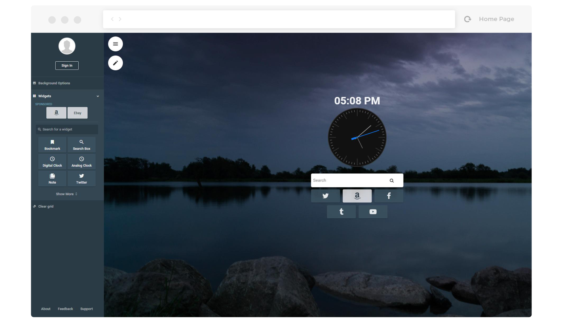
email
clear

CharityTab

Okorana
About

Browser tab, reimagined

CharityTab is built on the idea that giving should be as simple and convenient as browsing the internet. That is where the idea came about, giving based on tabs you visit. Think of this simply as giving based on your everyday activities, which pretty much is hassle free. Donations every few months to organizations selected by you and the rest of the community.

Details
  • Year 2017
  • Internal Work
  • Branding, Product Design, Strategy

Navigating system

We realized finding a way to provide an efficient user experience that also maximize the content provided by the system, was going to be one our major undertaking. This was solved by building a sidebar navigation system thats across/work devices and screen sizes. Not only that we allowed users to customize their views, which allowed additional buttons to be placed on the tabs page.

Usability testing

We conducted extensive usability testing against early-stage prototypes which ensured a responsive website layout that delivered against the key objectives of simplicity, engagement and intuition.

Branding & Iconography

While working through CharityTab we envisioned the logo around the globally recognizable heart symbol. We utilized an in image that people already know and cherish while making the symbol unique to CharityTab. The colors used also represent charity and correlated to the iconography that had been chosen to represent the brand.